Website Design: Why study your competitors
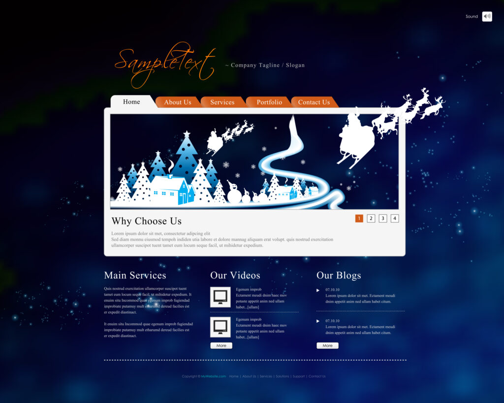
The site does not exist in a vacuum. When the user makes a decision of website design, for example, to buy, he chooses between the ordering company and its competitors. And the path between them is just one click to switch tabs in the browser.
There are at least three reasons to look at competitors’ sites:
- Understand the general market situation. Who provides what products/services, who is big and a leader, and who is small but fast-growing, who is focused on what target audience and what functionality it provides. Usually, it is the customer’s task to deal with all this and pass it on to you, but there is not always a holiday on our street.
- Based on this, determine what functionality is worth and not worth doing on your site. It is important to identify points of parity and differentiation: not to lose to competitors (everyone has filtered by price, but I do not, although users need it) and at the same time be different from competitors (I have filtered by color, while others do not).
- Steal like an artist. Look at the references to synchronize with the customer’s tastes, take note of how to implement this or that feature, and also reuse the existing user experience. People are already accustomed to the fact that on sites this is the arrangement of the basket, it will be strange for them if you have something awesome-cunning-creative-unusual.
Mobile First or Not First?

Where to start – from the web or from a mobile phone? Website design often starts today not with a web version, but with a mobile one. People spend more and more time online on mobile devices rather than wide screens. Because of this, more attention should be paid to the mobile version, since it is more likely that users will interact with it. I recommend starting the design with the mobile version, and then adapting the elements for wider screens – this way you will avoid a situation when a beautiful and sophisticated block on widescreen is not clear how to adapt to a mobile (which is more important).
But, again, approach this question consciously: analyze where your target audience is more sitting? In what conditions will a user be more likely to solve his problem using your website design – sitting at home or at work with a laptop or running between metro stations with a phone and bags at the ready?
Visual concept
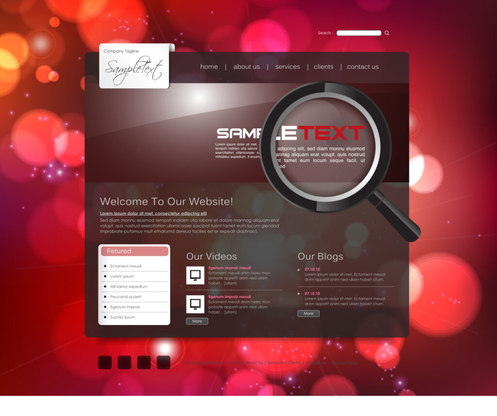
First of all, I recommend coming up with a key image of the site, it will be much easier to start from this when choosing a design: imagine him as a person – with character, appearance, his own characteristics, communication style, and behavior. This “person” will offer customers and users products or business services. And here it is important not to forget about the target audience and competitors of the website design: what kind of character and method of communication will best “enter” customers’ website design? Or what should be the image be different from the competitor’s website design?
Naturally, this image needs to be described somehow and synchronized with the customer. In addition to the text description, there is a great tool – a mood board. It usually looks like a set of pictures, colors, phrases, photographs, and other details that will help describe the general mood and set it for the implementation of the design.
Matching colors
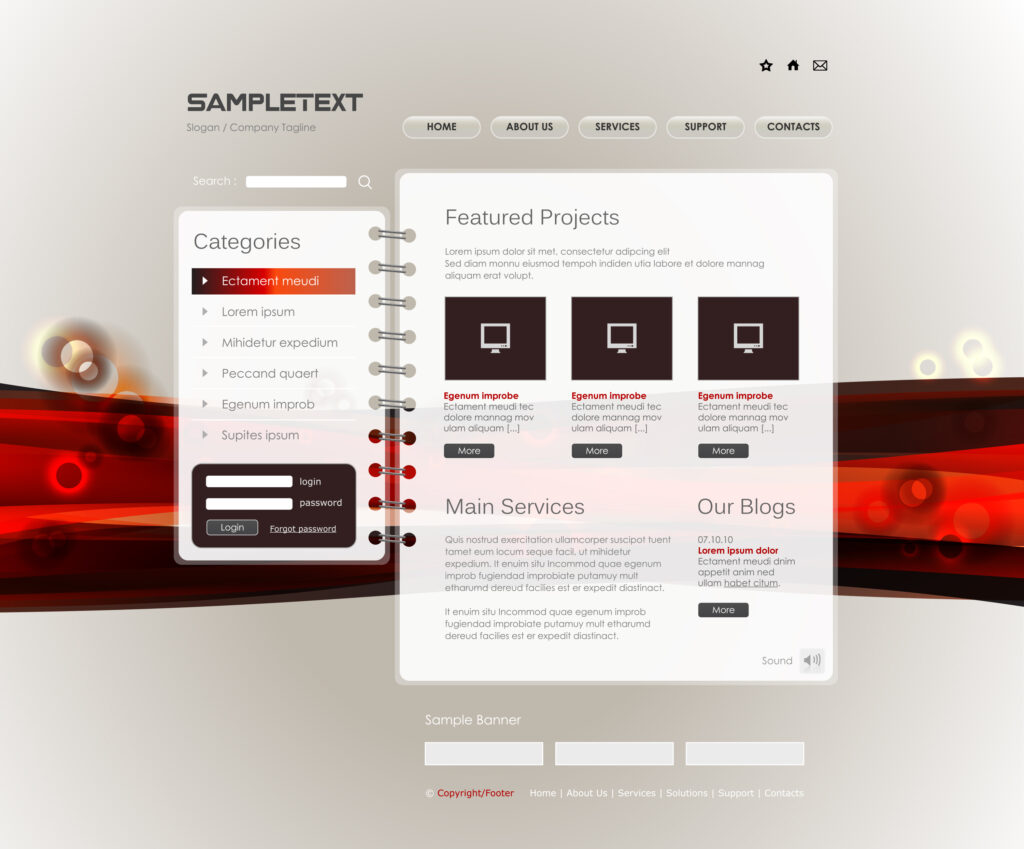
After creating a site image, choosing a color palette doesn’t seem like a big deal. Now we know what kind of character our site will be – so let’s choose colors that will help to reveal it.
Colors have a psychological effect on us: there is a theory that different colors cause different emotional states. For example, red is more about active motivation, and blue is calmness and reason, green is life, peace, nature. Agree, it would be strange to make a website design for children in black, and a website design for a car club in pink. You can read more on this topic in Johannes Itten’s The Art of Color. There will be about characters, and about the use of the color wheel, combinations, and contrasts.

